A consistent complaint you will hear from anyone with a background in design is about the improper use of (or the use of awful or outdated) Typeface. I love driving around or watching TV with designer friends of mine. It inevitably becomes a game of picking out what fonts are being used in the billboards, commercials and advertisements. Is the proper use of typography in the eye of the beholder? In some ways yes, and in many other ways no. The reality is, there are some very basic and easy to follow principles when selecting and using typefaces and fonts in your documents and designs. Today we are going to help you better understand the basic styles of typography and give you some resources to help you up your “typography/font selection and implementation” game. In a latter post we will dive into different typography terminology and understanding fonts on a deeper level.
Fonts vs. Typeface
First things first, you may have noticed that I am using two terms for the same thing… or am I? Two words you will hear used are “Typography” and “Fonts”.
So what is the difference between a font and a typeface? Are they the same thing? Martin Silverant says on mentalfloss.com “A typeface is the collective name of a family of related fonts (such as Times New Roman), while fonts refer to the weights, widths, and styles that constitute a typeface (such as Times New Roman Regular, Italic, Bold, etc.). Not all typefaces consist of multiple fonts however.” So basically typeface is the correct name for Times New Roman. 12pt Times New Roman Bold is a Font.
Basic Typography Styles
This list of styles isn’t all encompassing by any means, but knowing these basic styles will help us define font placements in the next section and will help you understand our 3 basic laws for font selection and use.

Serif & Sans Serif
One of the first terms to understand is “Serif”. Typefaces are often described as being serif or sans serif (without serifs). The most common serif typeface is Times Roman and the most common sans serif typeface is Helvetica.
But wha t is a serif?
A serif is a small decorative line added as embellishment to the basic form of a character. They are the little embellishments or strokes added as a stop to the beginning and end of the main strokes of a character. In more simpler terms, they are the little tabs added to each character that make them less simple. You may also hear terms like “slab” these are typefaces that have serifs that are square in shape.
Both serif and sans serif fonts are great for use in every portion of your design. They are great for headers and body text.
Display Typeface
A display typeface is a typeface that is intended for use at large sizes for headings, rather than for extended passages of body text. Display typefaces will often have more eccentric and variable designs than the simple, relatively restrained typefaces generally used for body text.
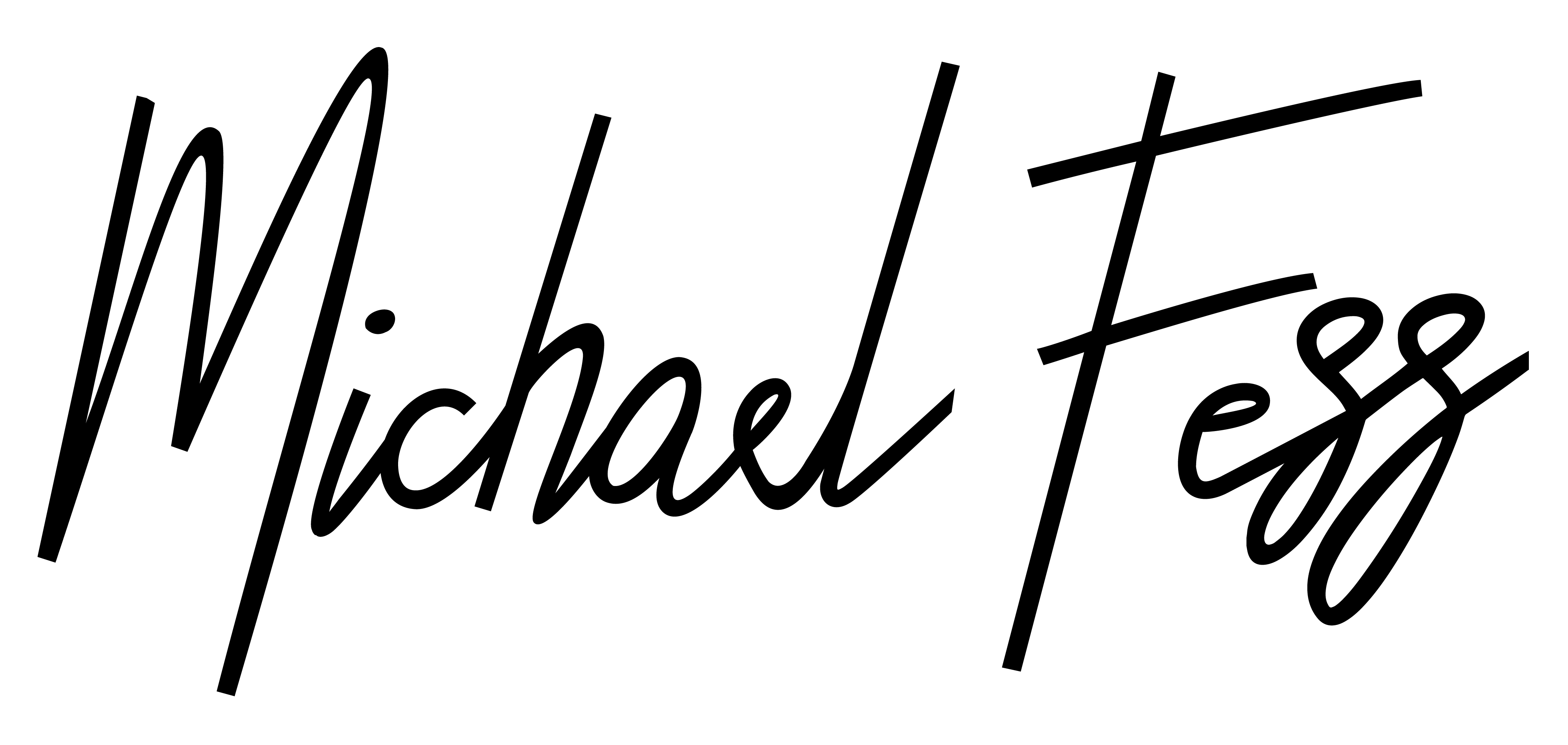
Hand Drawn/Script Typeface
Hand drawn fonts and script typefaces are exactly what they sound like, they look as though they were drawn by hand. Hand drawn fonts are a fantastic option for use in your design to bring it to life and give it some personality. These typefaces should never be used as body text or “copy” in any design.
In our opinion, the more the font looks like it has actually been hand drawn the better. Pay close attention to how each character flows into each other. Watch to make sure that tails and defenders don’t randomly cut off etc.
Monospace Typeface
A monospaced font, also called a fixed-pitch, fixed-width, or non-proportional font, is a font whose letters and characters each occupy the same amount of horizontal space. This contrasts with variable-width fonts, where the letters and spacings have different widths.

Basic Font Placements
Headers
A header is a separate bit of text at the top of a page or section. A header might be the title on a document, on a poster it may be the title/name of the event and on a webpage it is typically a short piece of text that describes what the paragraph will be about. In this section you are reading now, the header would be “Basic Font Placements”.
Headers should be either a bold Serif or Non Serif font or a Display, Hand Drawn/Script or Monospace Font that compliments your design. It should be the largest font in your design or document.
Sub-Headers
Much like a header a subhead is a bit of text at the top of a page or section but in the hierarchy of the page or section is below the header. In this section you are reading now a sub-header would be “Headers” and “Sub-Headers”.
In some instances using the display, script or monotype font you are using in your design would suffice. Also a bold font of your Serif or Ssans Serif typeface would be adequate.
Body/Copy
The body text or body copy is the text forming the main content of a book, magazine, web page, or any other printed or digital work. This is as a contrast to both additional components such as headings, images, charts, footnotes etc. on each page, and also the pages of front matter that form the introduction to a book.
Body text or copy should ALWAYS be a Serif or Sans Serif typeface. DO NOT use script, display or monospace typefaces for body text/copy.
Maxxwell’s 3 Basic Laws for Font Selection & Use
We have some laws that we live by here at Maxxwell when it comes to Typography. We know that in some design instances breaking the rules can be a little fun and exciting. Other times, like a mother who steals a loaf of bread to feed her starving children, the rules need to be bent for one reason or another. Nevertheless, if you follow these three simple laws, your designs will without fail, look a lot cleaner and more professional.

Law No. 1: One Font & One Typeface
Never use more than 2 different typefaces in any one design. We recommend choosing ONE FONT for your Titles/Headers. This can be a font from any typeface you choose. Display, hand drawn and script fonts are a great consideration for titles/headers. Then choose ONE typeface for the remainder of your document or design.
Law No. 2: Clean & Clear Body Text
Only use serif or sans-serif typefaces for body text/copy. Nobody wants to read a full document in a script font. It may look “cool” to some but is an amateur move.
Law No. 3: Consistency Matters
Consistency matters in every aspect of your design or document. If your headers are 16pt Helvetica Neue Bold in a Blue colour in one section, they should be formatted that way through your entire document/design. Pay close attention to how you have used type and fonts in your document and ensure that your titles, headers, sub-headers and body formatting are consistent through your entire design.
If you want to take things to the next level, pay close attention to the leading (line spacing) and kerning (letter spacing) of these sections as well.
Recommended Fonts
Here are a few of our favourite free and paid typefaces/fonts that we use on an almost daily basis.
Our Favourite FREE Typefaces/Fonts
One of the best places to get great typefaces for free is Google Fonts. Not only are these fonts open source and free to use on your next project, they also are available for use in web and application projects too. Another Typeface that is incredibly powerful that we use for icons/dingbats all the time is Fontawesome. They too have desktop and web versions of their fonts available. Some other sites that are great to snag a free typeface or two are dafont.com and fontsquirrel.com. Here are some of our favourite FREE typefaces.

Our Favourite Paid Typefaces/Fonts
Sometimes you gotta pay to play. We have a few typefaces that we have purchased over the years that we absolutely love and use all of the time.
Where to Buy
We purchase our typefaces from a few different places. We have a Typekit subscription through Adobe Creative Cloud, then we use sites like Fonts.com and myfonts.com to purchase most of our standard typefaces we will use for body text/copy. We also use sites like creativemarket.com and Envato Elements to purchase display, hand drawn and script typefaces.

Hot Fonts for 2020
Recently we have been tackling a number of branding projects and stumbled across this incredible article by creative boom that provides a fantastic list of hot typefaces for 2020.

Part Two Coming Soon
As I said earlier in this post we will be posting a second part to this blog that will dive a little bit deeper and look at font/typography terminology like leading and kerning and the different parts that make up each glyph in a font. In the mean time, we found a great site that breaks down the different terms and attributes of typography by TypeDeCon, check it out here!
Until then, happy typography-ing!
IMAGE CREDITS: